In this article, we'll take a look at how Jigsaw charting is put together and our philosophy when it comes to charting. Where we will go and where we won't. How we'll be different. What you can expect from us.
First of all, I'll preface this article with the fact that the following were all absolutely true at the time:
- When we produced Depth & Sales, I promised myself it would be for analysis only, not a trade execution tool.
- After making it a trade execution tool, I promised myself we'd never create a stand-alone platform.
- After creating a stand-alone platform, I promised myself we would not add regular charts.
And here we are:
So if I say we absolutely won't do something. That is prone to change!
Why Add Charts?
Looking back, it seems ridiculous that in 2012, someone would have entered the crowded Trading Platform market with a platform that had no charts at all and be successful. Most of our customers use daytradr alongside another charting app. They've been asking for charts since the start. Times are changing too. Traders are feeling the squeeze. Data fees are rising and CME are classifying traders as professional based on how many apps they connect with. Just 3 makes you a professional. That can be $1000's in data fees each month.
So here we are - but we like to do things our way. In this article we'll explain how we will progress.
Chart Philosophy
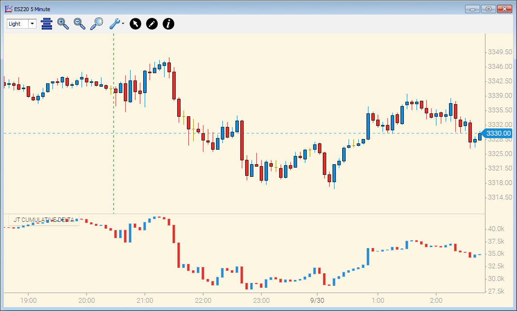
It's well known that we aren't big fans of indicators. We have developed a few like Market Profile, Cumulative Delta, CSI and Footprints where we see edge and value.
Our charts are partly based on a 3rd party library that has a number of indicators included. We decided to include them. We hope to wean you off them.
Apart from that, there will be nothing in our charting app where we cannot explain WHY it is there, WHAT it is telling you and HOW it can assist during your trading.
This is in line with how we develop the rest of our app. Simple to use, no fluff, minimal configuration required and they work straight out the box. Some people like a million settings on every indicator and spend hours and hours tweaking them - other platforms do that, it's not our thing.
We have 2 background colors - dark and light. Lighter backgrounds are tough on the eyes. Regardless of the background color - all default colors on all charts and indicators have been mathematically derived, so that everything is visible on the background and there's no clashes with other items on the chart. One major annoyance on a platform I won't name is that I'd change the chart type and the bars would become invisible. I'd waste time making charts and other items work with each other. You can still change many colors but we think it's easy on the eye as-is. Other color schemes will come - especially focused on specific eyesight issues.
Performance of charts will peak when they load but our goal is less than 1% per chart on a mid range i7 CPU PC. Depth & Sales and Trade Execution are prioritized from a performance perspective and we have throttling code in the charts to prevent over-consumption at peak times without being visibly laggy.
In summary - nice and simple, with features that help with edge. Where setting up isn't like trying to build an Ikea bunk bed.
How it Will Evolve
Our application set evolves based on our own ideas and retail/professional trader requests. With requests, even for things that are common in the industry, we like to take a clean slate, consider the benefits and ask ourselves "If we were the first people doing this - how would we do it?". It's more fun that way. We do try to get buy-in from the requestors up-front for the alternate approach where possible.
We will be taking requests, we will be implementing them - but we are designers at heart and we want to keep the creativity in our lives.
What's been done so far is what I've always done in R&D roles - get something to the users with rich functionality. Just don't try to make every minute decision yourself. Give people enough that they will use it and let their feedback tell you where to take it next.
So that is what's happening now. It's a journey. I really appreciate those of you that are taking it with us.
The End - for normal people.
Part 2 - Nerd Stuff - Skip if not Nerdy!
With the introduction of News in daytradr, it became the first and only hybrid cloud/windows trading platform that I know of. Charts continue this philosophy.
I spent 17 years in senior management of multinational software technology firms with 14 of those years running a major portion of R&D for one company. I saw a lot of technology come and go. I saw a lot of companies jump on tech fads and lose millions. FOMO.
Cloud based apps have obvious and undeniable benefits. I also think that right now, there's certain functionality daytradr has where windows technology has an edge in performance over cloud:
- API Integration - windows based
- Number crunching - windows based
- Higher performing tools - (recon tape, gauges, meters, Depth & Sales, Summary Tape) - Windows based.
- News Window, Eco Release Window, Charts - cloud based tech
A good example is Depth & Sales. We use technology where we control every pixel on the display. Data comes in on one thread, gets crunched on another thread, calculations of which pixels to update are on another thread and finally the UI updates on another thread. Why all these threads? Well each thread can run independently on a different core on your processor. It spreads the load. Other techniques such as queues and throttling exist to prevent overloading at peak times.
But cloud apps are faster to build and you don't need little Einsteins to build them. Complexity is lower. For the charts, here is how we split the load:
- Inbound caching of chart data (tick database) - Windows based tech
- Data aggregation (e.g. 1 min from tick database to 5 min for display) - JS/Chrome
- UI Rendering - JS/Canvas/Chrome
Canvas is ultra-fast at rendering the UI. It's all executing on your PC but the code is on our cloud server and downloads on demand. When running the app, you'll end up seeing the split in task manager:
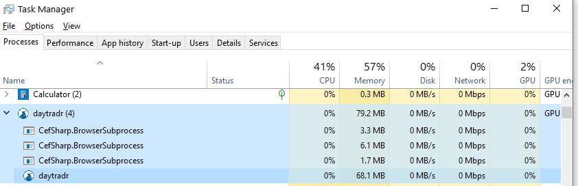
The daytradr icon at the bottom is the windows based tech, the cefSharp is the browser tech.
From a performance perspective - we do expect peaks as a chart is opened. We don't care too much about that, in fact it shows good utilization of resources when required. After that peak, the goal is that any individual chart should run at less that 1% CPU on a mid-level i7 8-core processor.
That is the current tech stack and apart from making the developers cry when I told them about the hybrid requirement, it's working well. You just can't get many answers from Github when you have a tricky issue to resolve! But where's the fun in that?
Thanks for reading.
Peter