
If you ask traders what the most important information is when making a trading decision, most will say “price”. Some will say “volume” and the more enlightened may say “Value” which is really a combination of price and volume.
In fact, when it comes to making a trading decision, it’s really “other traders’ behavior” that is most important. After all, when you enter a long trade, you’ll only make money if other traders buy after you do. For a continuation trade, that means you want traders to continue behaving the same way. For a reversal trade, you need overall trader behavior to change.
To some extent, understanding other traders’ behavior and where other traders may be positioned can be done with a basic price chart. In a consolidation area, we can rightly presume that we are building more and more positions, the longer we consolidate in an area. We can also presume that stop-loss orders are building outside that zone and that when we finally break out of the consolidation zone, stops will be triggered which will help accelerate any move out of that area.
These are presumptions, but valid ones. What regular price charts can’t give us is more solid proof of behavioral changes. That is where Auction Vista charts come in. Let’s look at the components of an Auction Vista chart and then go over what they tell us about trader behavior.
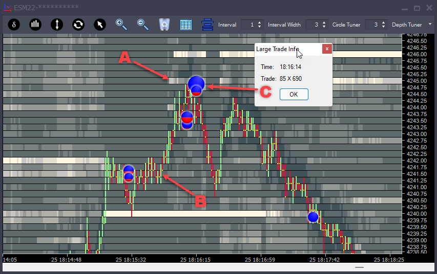
Figure 1 – Auction Vista Chart, eMini S&P500 Futures
The auction vista charts show historical and current trader behavior. Just like a price chart, the history is to the left and the current action is to the right.
A – Market Depth History – This shows a rolling view of changes in limit orders. Bids (buy limit orders) and offers (sell limit orders). Lighter colors indicate areas where there are more limit orders and darker where there are fewer limit orders.
B – Price Bars – Green bars indicate that we traded more buy market orders than sell market orders, and Red bars indicate that we traded more sell market orders than buy market orders
C – Large Trade Circles – Shows where exceptional size is traded, both in real-time and historically. A self-tuning algorithm recognizes where exceptional size trades at a price over time (not in one individual interval). The size of the circles is relative, larger circles mean more volume. The mix of red and blue represents the mix of buy market orders to sell market orders. In this case, we can see 85 sell market orders compared to 690 buy market orders.
In this image, we can see that as we approach 4245 from below, the offers there are much higher than anyone else (point A on the chart). As we move up, the coloring of the offers at 4245 becomes lighter and lighter. That means more contracts are being added. We know that many times, limit orders are “spoof” orders, which means the person placing them just wants to fool us into thinking the market is weaker or stronger than it is. In the case of spoof orders, the orders will be canceled as the price approaches them. At point A, the opposite is happening. Orders are being added as price approaches. That means there is a good chance the limit orders are real.
At point C, a large circle appears. The circles represent market orders. We can see that we have 690 buy market orders buying FROM the sell limit orders. This is a very large number of contracts to trade on ES Futures. In addition, it is mostly buying. We call this an “opposing imbalance”. At a high, that is where we see buyers far outweigh sellers, and at a low, where we see sellers far outweigh buyers. This is buyers getting trapped. Buyers keep buying, but the price is no longer progressing upward. Then shortly after this, the market reverses.
So why does this happen? Well, let’s say you were at a large trading firm and you had 1,000 ES contracts to sell. To do that AND do so at a good price, you need people to buy from you. So you place limit orders that absorb that buying. At some point, buyers are going to realize what is happening and the buying will slow down. You still need to sell more contracts, but your limit orders are no longer being filled. You change from passive selling (with limit orders) to active selling by selling at the market aggressively. This action of selling at the market not only drives the price down but also causes those trapped buyers to exit their trade, which generates more selling activity.
Much of the time, this is exactly how reversals in the markets occur.
Let’s look at another example:
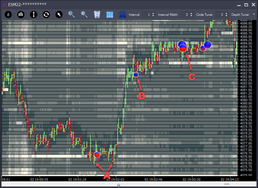
Figure 2 – Auction Vista Chart, eMini S&P500 Futures
Point A – Here we have an opposing imbalance, excessive (trapped) sellers at the low. This creates a “hidden backstop”. Areas where we see trapped traders end up acting as support/resistance later on. They are hidden because these areas would not be visible on a regular price chart.
At this low, we see large bids that were taken, but there are no large bids at the prices we trade. That means the bidders must have added contracts as sellers traded into them. This addition of contracts is known as icebergs. There is often as much information in what you see as what you don’t see. When you see a large circle and no excessive limit orders, it means someone is trying to hide their buying/selling with an iceberg order.
Point B – It is quite common that the absorption or “trapping” of traders occurs over a series of prices. As we move towards point B, we can see that the limit order offers above us are above average. As we move up, we see a trade circle, indicating that it is taking a lot more buying to move the price up.
Point C – There will always be occasional excessive volume mid-range. There are a couple of things to consider when looking at the large trade circles.
First of all, are we in an area you would like to buy/sell anyway? In this case, we are above point B, so we continue to sustain the upward move.
Secondly, do we see the excessive size on the limit order side at these prices? This is not essential, but large bids and offers do give us a ‘heads up’ that other people are interested in these prices.
Highest Risk Entry – when we see the large buy limit orders below.
Medium Risk Entry – when we see the large circle form in real-time, and we know sellers are getting trapped.
Lowest Risk Entry – when passive buyers turn active and the price starts to move up past the circle. This is where late sellers will get stopped out of their trades.
It’s really down to your appetite for risk. The earlier entries are riskier but tend to give a better trade entry price. The later entries are less risky, and you pay for that with a poorer entry price.